Magazine practical task: blog work
Research
Research
1) Use your lesson notes on magazine genres and conventions to view a range of potential magazine covers. Create a shortlist of three potential magazines and embed an example front cover from each one.
2) Select your chosen magazine to create a new edition for and explain the thinking behind your choice.

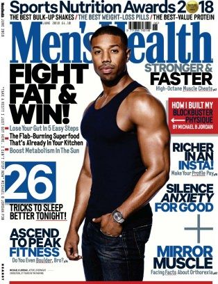
This is the chosen magazine that I am going to take inspiration from to create my own men's health magazine.
3) Find three different front covers for your chosen magazine and embed them in your blog post. Analyse the fonts, colours and typical design. What is the language or writing style? How are the cover lines presented? You need to become an expert in the design and construction of this magazine and its branding.
They have included a few different font styles without losing the professionalism of the poster. Although it is professional, it still creates a relaxed feel because of the background it is set in and the main focus's facial expressions. The texts included is somewhat formal as they don't include slang or informal words but it is also not written in a 'posh', grammatically perfect form. The magazine has set an image for themselves by using a celebrity as their main cover of the magazine instead of general public as it would be more likely to catch audiences attention if it is a familiar face and even if the public don't usually read the magazine, they may read this edition if it featuring their favourite celebrity and get hooked onto the magazine from there. By using a celebrity; musician/rapper they are also suggesting certain genres of the magazine such as celeb gossip and music.
The magazine tends to keep the amount of colours to a minimum but the two main colours are bright and eye-catching. Red has been used in the heading as it is known to be the most eye catching colour for humans. They also use big and bold writing for the main text as it catches audience attention and is also easy on their eyes to read.


No comments:
Post a Comment